Smart Financial
Overview:
As a UX Consultant for Smart Financial, I was hired to help the stakeholders strategically plan their next steps. They had the idea and the developers but had no design or UX expertise. I came in to help them understand their users and help brainstorm what the app could look like.

App
FinTech startup that specializes in personal wealth management. They help manage, educate and guide you to your financial goals. It combines all things finance into one easy-to-use app.
Challenge
Use design to create an inviting and intuitive experience for users where they trust that their financial information is safe and can choose to learn about finance on their own terms.
solution
To tackle the challenge, I designed the three core pages where users would spend time in the app: on boarding screens, the home/dashboard screens, and monthly budget/ budget summary screen.
Building User Trust
Problem
Trust is everything. Users need to trust the app with their personal and financial information.
need
We need to make the app feel trustworthy and make users feel like all their information is protected.
solution
Create a preview CTA, display safety measures (padlock, facial recognition), and make the app feel familiar.
Presentation of Information
Brand Mission
Increasing Financial literacy amongst users is a core mission for the app. How can the design help with this?
How Might We
Make sure that the information is easily understood and digestible for users to take in and learn on their own terms?
solution
I focused on the jargon used and the way the information was presented. I made sure that the app felt intuitive and welcoming to users at every level of their financial learning journey.
Building A Design System
Since this company was on a tight budget, it was important to me to create a strong design foundation which they can build. They had their brand colors set but no style in mind. I conducted some user research to better understand what users were looking for.
Clients
The clients wanted something simple that used colors from their logo (stern no new logo and must use current colors)
Users
During interviews, the users spoke about wanting an app that was friendly, welcoming, trustworthy, and unintimidating.
solution
Refresh brand style and color palette with something easy going yet professional. Something light, trustworthy, and inviting.

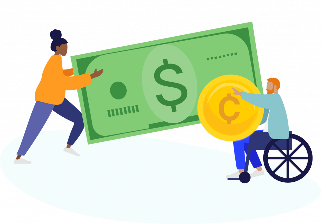
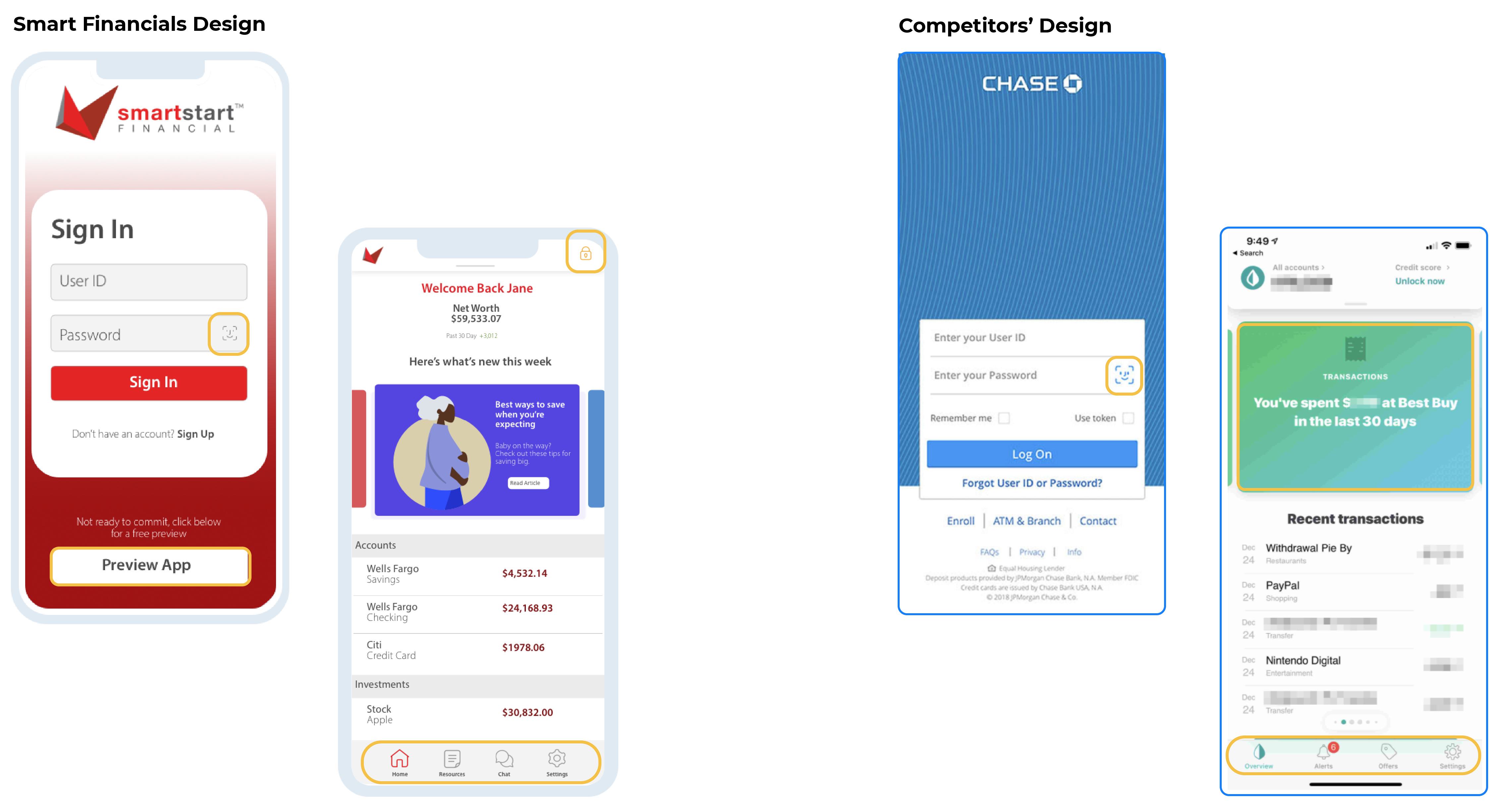
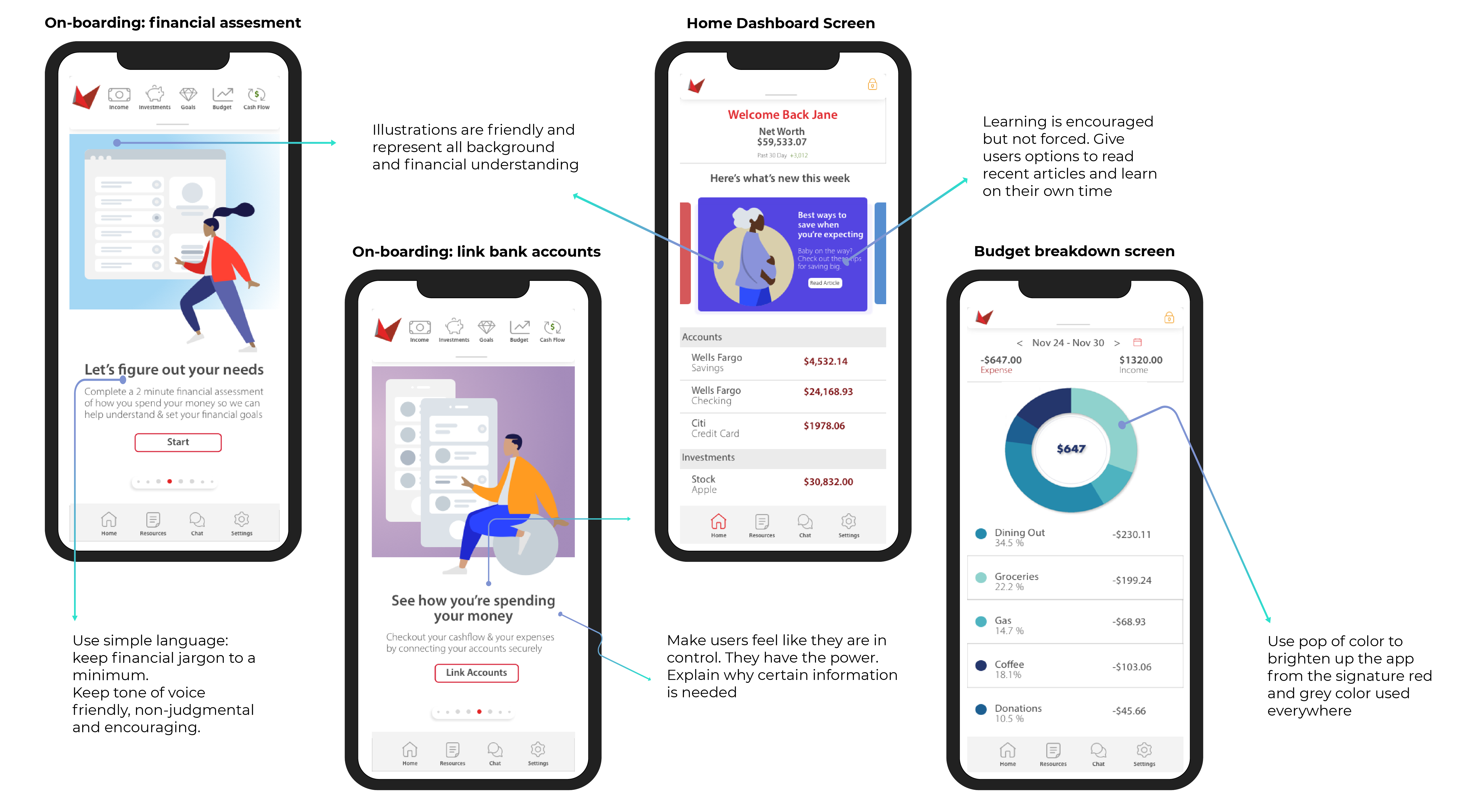
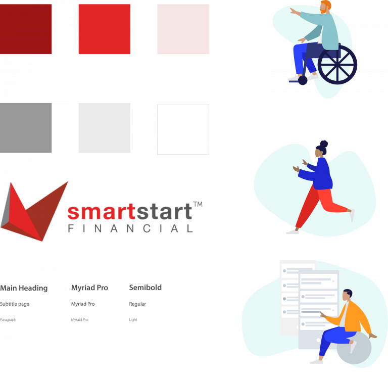
I made sure to use free illustration libraries, such as Humaaaans, to be cost conscious and to make sure they had an easy way to add customizable illustrations to use as the app grew, since hiring a full time UX designer was not in the budget. It was also important to me to show them how the new designs would transfer to desktop: this led me to create a landing page.